

Last week, Google implemented a mobile friendly ranking criteria for pages within their search results. The update can move your site up or down depending on how well your content displays on mobile devices such as smartphones and tablets.
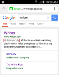
Sites that pass Google’s criteria for mobile friendliness now have a new label next to them in search results:
So, how should you adjust your content to adapt to this new world order (read, new mobile-friendly ranking algorithm)?
Google cares about mobile, and you should too.
Simply put, not everyone uses a desktop computer to browse the internet anymore:
- 80% of all online adults own a smartphone,
- 75% of Americans admit to bringing their phone to the bathroom,
- 48% of Google’s traffic comes from mobile devices, and
- US marketers will spend nearly $42 billion by 2018 on mobile advertising. In fact, mobile advertising is growing faster than all other digital advertising formats!
Google places user experience as their highest priority. If the content on your website is difficult to navigate, read, and access on a mobile device, why would Google want to recommend you to someone using a mobile device? And, why would a potential visitor want to visit a site that they could have trouble with?
Luckily, Google has developed a straightforward mobile friendly test.
It’s a simple tool that crawls a URL and lets you know whether the page is mobile friendly or not. Take the test yourself! We did, using an article from our blog on thought leadership:
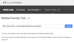
After clicking Analyze, Google crawled our article and gave us our answer – this page is mobile friendly!
It was interesting to see how Googlebot viewed our article, and that our blog was mobile friendly. However, I wanted to find out what Google was basing their judgement on. I picked an older site at random to put into Google’s tool:
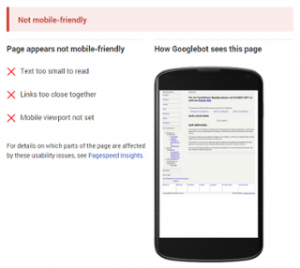
There we go. Google easily assesses the older page. You can barely make out the text on the mobile screenshot. And, Google gave three reasons for its decision:
- the text is too small to read,
- links are too close together, and
- the mobile viewport was not set.
Google’s mobile usability guidelines
If your site didn’t pass the test, check out the full set of guidelines. The bottom line is that Google’s algorithms are getting better at assessing what makes a good experience for a reader – and that’s what really matters! Here are some of their actionable recommendations:
Build responsive content.
Your content should adjust to the screen of the device it’s being viewed on. If it can’t all be displayed on the screen at once, it should only display a particular section (the viewport). A visitor should be able to navigate to other sections of your content with ease.
Avoid horizontal scrolling.
We’re used to scrolling up and down on web pages but not left and right. When building responsive content, be sure all words and images in a viewport can be seen vertically. If images do not fit, change the size to be relative to the screen.
Use scalable fonts.
Keeping with the responsiveness theme, make sure your text size also adjusts according to the screen. Someone should never have to zoom in or zoom out to read your content. Test different font sizes to make sure it’s legible for all screens.
Space out buttons and links.
When I’m viewing content on my smartphone, my fingers sometimes tap the wrong button or link because it’s too close to what I actually want to tap! When placing touchable elements, be mindful of neighbouring elements.
Don’t use Flash.
If you have audio, video, or animations embedded within your content, use HTML5 as your core web technology instead of Flash. Most mobile devices do not support Flash and can’t view your content. Google can’t see your content either.
Overall, take a mobile-first approach to content!
Most of the time, we tend to morph the desktop experience to the mobile experience by cutting away elements in our content. I suggest you do the opposite: design content for mobile first! This mindset will help you focus on core elements, fluidity, and adaptability. The benefits will extend fare beyond Google’s mobile friendly criteria.
Mashable and Etsy both do a great job of mobile-first design. I suggest you check them out on your smartphone!
John is the Founder & CEO of Wriber. He’s passionate about entrepreneurship, high-tech startups, thought leadership, content marketing, and artificial intelligence. John frequently volunteers his time at the University of Waterloo to help young entrepreneurs get their businesses off the ground. He’s also a faithful Toronto Maple Leafs fan, frequent Redditor, and lifelong learner.